
A good payroll dashboard will typically include a variety of features and options that allow users to see all aspects of their payroll information in one place. This can include things like current and past payroll data, employee information, tax information, and more.
A good payroll dashboard will also offer customisable options so that users can tailor the display to their specific needs. Additionally, a good interface will be easy to use and navigate so that users can quickly find the information they are looking for.
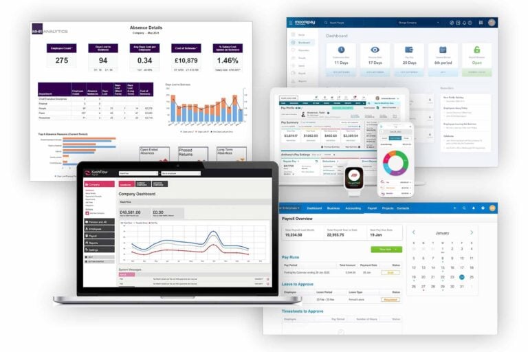
So which of the leading software products has the best user interface? Read on for our detailed comparison of the best payroll dashboard examples.
Xero payroll dashboard
The Xero payroll dashboard is designed to give you an overview of your payroll data and processes. The user interface is simple and easy to use, allowing you to view your payroll information and perform tasks with just a few clicks.
The dashboard provides you with a variety of options for viewing your data, including a graphical representation of your payroll information, a list view of your data, and a detailed view of your payroll processes.
You can also access the Xero support site from the dashboard, which provides you with a wealth of resources for managing your payroll.
Sage payroll dashboard
The Sage Payroll dashboard provides an overview of your payroll data, as well as tools for managing your payroll processes. The user interface is designed to be intuitive and easy to use, so you can get the most out of your payroll system.
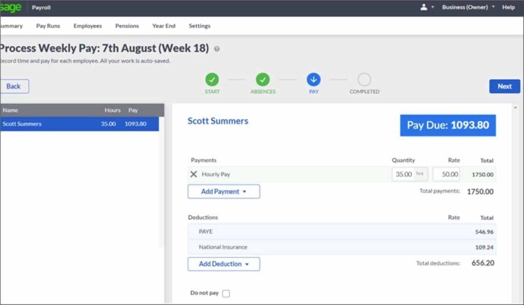
The Dashboard consists of three main sections:
- The left-hand sidebar provides access to the various payroll features and functions
- The main content area displays your payroll data and information
- The right-hand sidebar contains helpful links and resources
The left-hand sidebar is the primary navigation tool for the Sage Payroll system. From here, you can access all of the features and functions of the system.
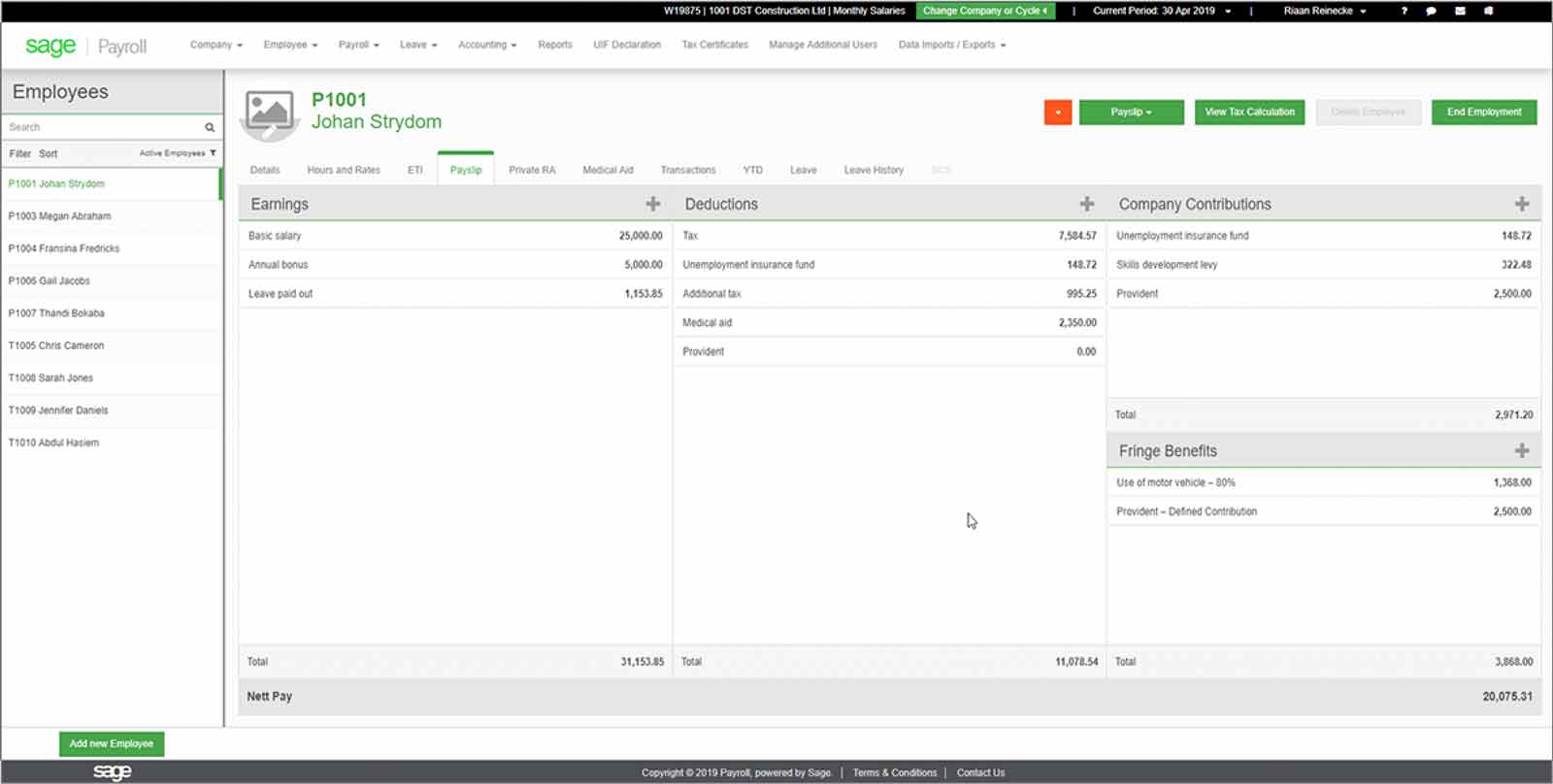
The menu options are organized into the following categories:
- Dashboard: This is the default landing page for Sage. From here, you can access all of the other features and functions of the system
- Employees: This section contains tools for managing your employees’ payroll information
- Payroll: This section contains tools for managing your payroll processes
- Reports: This section contains tools for generating reports on your payroll data
- Settings: This section contains tools for configuring the settings of your Sage Payroll account
The main content area is where you will find your payroll data and information. This area is divided into two sections:
The first section is the payroll overview, which displays a summary of your payroll data.
The second section is the payroll detail, which provides more detailed information on your payroll data.
The right-hand sidebar contains helpful links and resources. This area includes links to the Sage Payroll helpdesk, as well as the Sage Payroll forum. Additionally, this area includes a search tool, so you can quickly find the information you need.
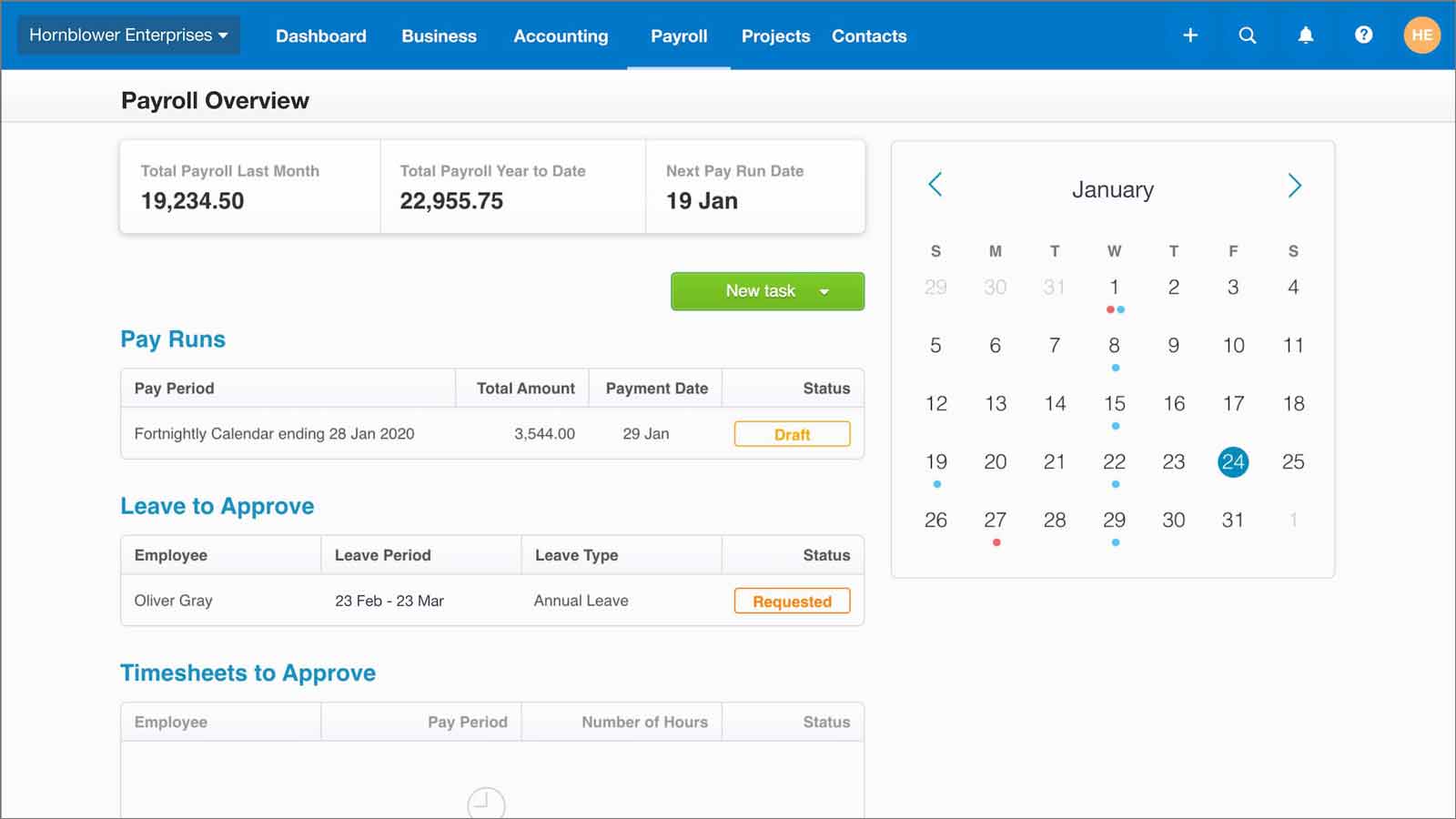
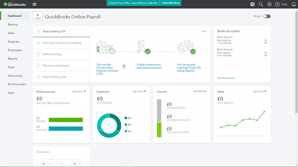
Intuit QuickBooks payroll dashboard
The QuickBooks Dashboard is the first thing you see when you log in to your QuickBooks account.
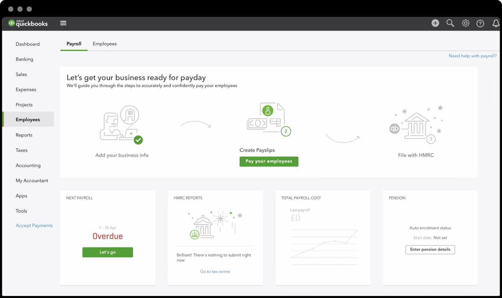
From here, you can view your payroll information and access all of the features of the software. The dashboard is divided into four sections:
- The Summary section provides an overview of your payroll information, including your current balance, upcoming bills, and recent transactions
- The Employees section lists all of your employees and provides information about their compensation package and payroll history
- The Payroll section allows you to view and manage your payroll data, including running payroll reports and making changes to employee information
- The Settings section is where you can change your QuickBooks settings, such as your company preferences and security options
The QuickBooks Payroll Dashboard is a convenient way to access all of the features of the software in one place. From here, you can easily view your payroll information and make any changes that you need to.
ADP payroll dashboard
The ADP payroll dashboard is designed to be user-friendly and efficient. The interface is clean and easy to navigate, and all the features and tools you need are readily available.
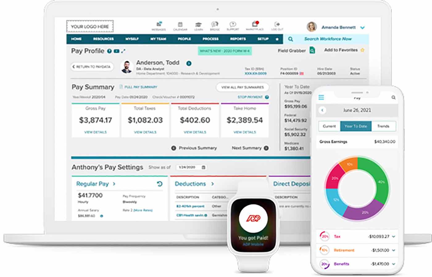
The dashboard provides an overview of your payroll data, including upcoming deadlines, recent payments, and employee information. You can also access reports, create new employees, and run payroll from the dashboard.
The ADP dashboard is a powerful tool that can help you manage your data and keep your business running smoothly.
MHR payroll dashboard
The MHR payroll KPI dashboard is a web-based interface that allows users to view and manage their payroll information.
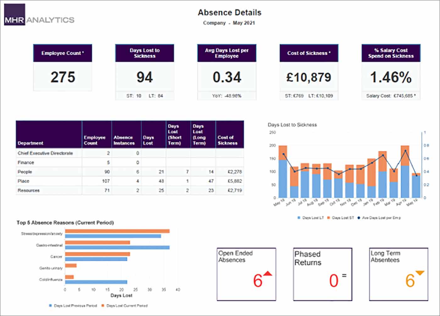
The dashboard provides a variety of features that allow users to view their payslips, track their time off, and manage their benefits.
The user interface is designed to be simple and easy to use, with a variety of menus and options that allow users to access the information they need.
The dashboard is also mobile-friendly, so users can access it from their smartphones or tablets.
Moorepay payroll dashboard
The Moorepay interface is designed to be user-friendly and provides all the information you need to run your payroll in one place.
The intuitive interface lets you see exactly what you need to do and when, so you can stay on top of your payroll tasks with ease.
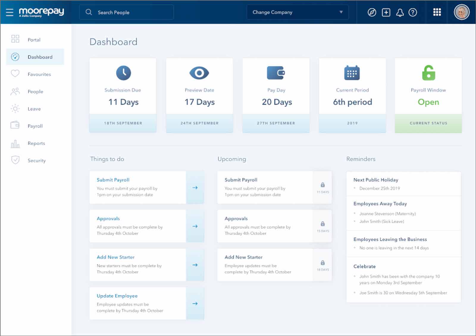
You can use the dashboard to:
- View your payroll schedule
- Add or remove employees from your payroll
- Run your payroll
- View your payroll history
The Moorepay payroll reporting dashboard makes it easy to stay on top of your payroll tasks and ensure that you’re always up-to-date. With everything you need in one place, you can focus on running your business and leave the payroll to them.
Kashflow payroll dashboard
The Kashflow payroll analytics dashboard is designed to be user friendly and easy to navigate.
The interface displays all of the information that you need to run your payroll in one place. This includes employee information, pay rates, and tax information.
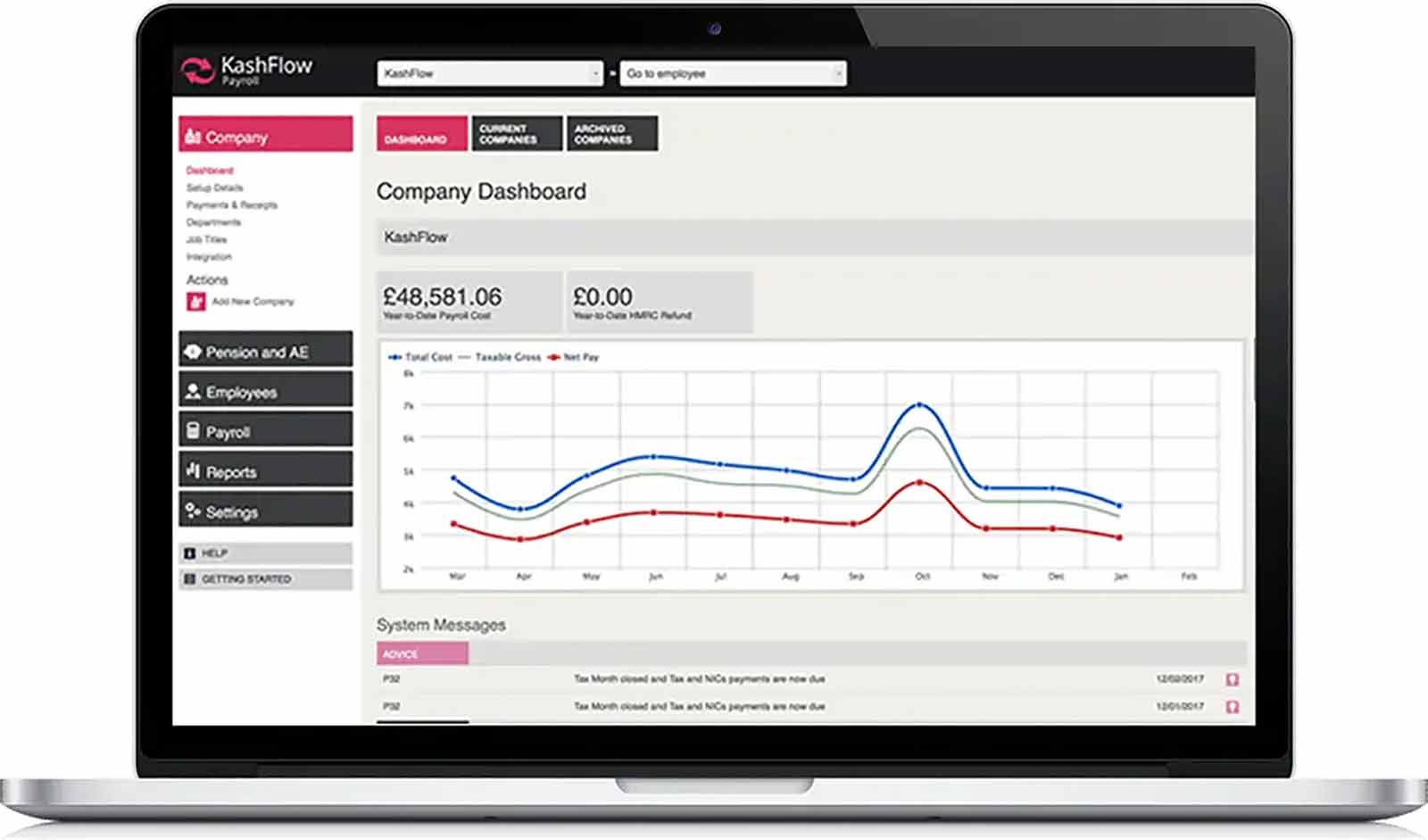
The dashboard also allows you to enter new employees and edit existing employee records.
The Kashflow payroll dashboard is a great tool for small businesses that need to run their payroll quickly and efficiently.
Payroll can be run from the dashboard with just a few clicks, making it a great choice for businesses that need to run their payroll quickly and efficiently.