
Looking for ways to boost conversion rate on your website? Web design can effectively boost conversion rate for any website. According to a web design usability survey, two-thirds of people would prefer to read something beautifully designed than something plain. And aesthetics is not the only factor deriving conversion for your site; the design subtleties make huge impact too. Listed below are 6 design principles which can boost conversion rate for any website:
-
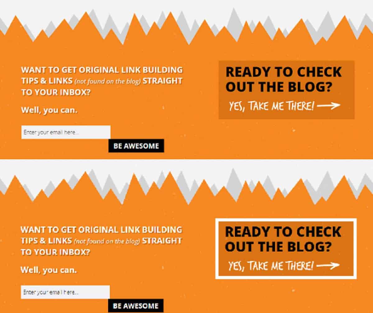
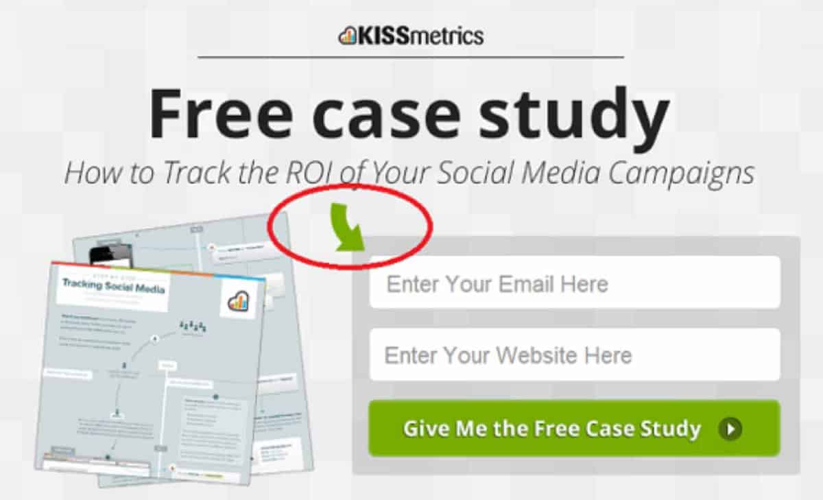
Put your call to action in a box
On a page, make your call to action obvious. Call to action should be put in a box or container; it will be the first thing that will grab the attention of website visitors. The elements on a web page like heading, images and content are there to support the conversion goal but what should stand out is your call-to-action. As soon as someone visits your page, your call-to-action should be the first thing that grabs attention. It is the most important element of conversion.
Look at the image below and see which call-to-action grabs your attention first:
-
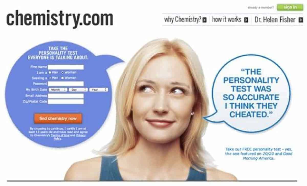
Use colours and contrast
Using different colors can result in different emotions experienced by the visitors on the web page. It is a proven fact that with the combination, contrast and capriciousness of colors, visitors can be attracted to a website and it can go other way too. The concept of using colors and contrasting them to create a certain effect is based upon the isolation via different theory which can also be interpreted as “in your face” approach.
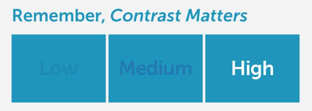
Use contrasting colors to keep your headline and call-to-action noticeable and readable. For your call-to-action, use a call color that stands out in stark contrast with the rest of the web page.
Following is an example of how color contrasts can help you making your CTA stand out:
-
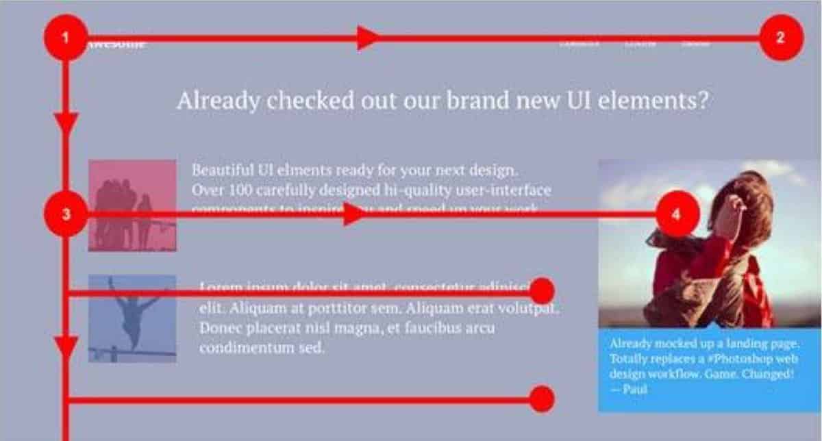
Use directional cues
Directional cues, whether explicit or suggestive point towards the call-to-action, making it more prominent. They immediately grab attention and direct visitors towards the call-to-action. Explicit directional cues are arrows or lines which direct visitors towards your call-to-action on the landing page. These directional cues are obvious and are used more often. Whereas suggestive directional cues are subtle and use imagery to direct visitors towards the call-of-action on a given landing page.
Here is an example of explicit directional cues:
Following is an example of suggestive directional cues:
-
Apply the 8-second rule
Most websites lose more than 50% of their visitors within first 8 seconds of them coming to the sites. Don’t make the same mistakes such websites make. 8 seconds does not seem to be a long time, but for someone browsing or surfing through sites just the first look of a website is sometimes enough for them lose interest in it. This rule applies to unique visitors who are viewing website for the first time.
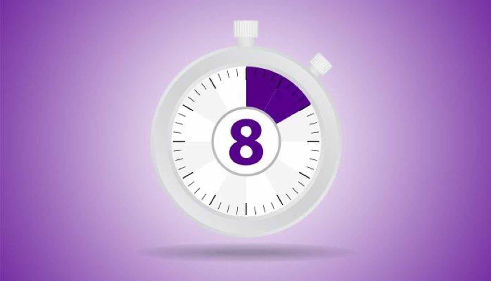
The window of opportunity to gain attention of the new visitor is very small but with the help of following tips you can make these 8 seconds count:
- Load time is one of the most deterrent factors for this 8 second rule
- Keep the heading relevant and brief
- Keep the content simple and to the point
- Leave plenty of negative space, do not clutter the web page with imagery and content
- Keep the signup page large and simple
- Use interactive content or multimedia like audio or video
- Always use hover effect on your clickable buttons.
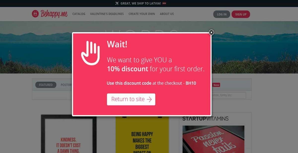
- For those visitors who lose interest, add exit pop ups.
- Use strong call-to-action words in the exit pop ups like “Subscribe”, “Get Discount” or “Get Free Shipping”.
A great example of exit pop-ups is given below:
-
Use F layout
According to various researches, it is the natural behavior of visitors to the read the web page in F pattern. They start out with reading the complete first line or heading but as they move downwards, they tend to leave off in the middle of the sentence only to skim read the next heading or line and even fewer words in the content after that. Keeping this in mind, focus on the pattern and lay out content which is most relevant at the top.
For boosting conversions, keep the most important and relevant objects and calls to action along the F shape pattern. And keep the content with low importance at the bottom of the page. Following is an example of a web page with and F layout in design:
-
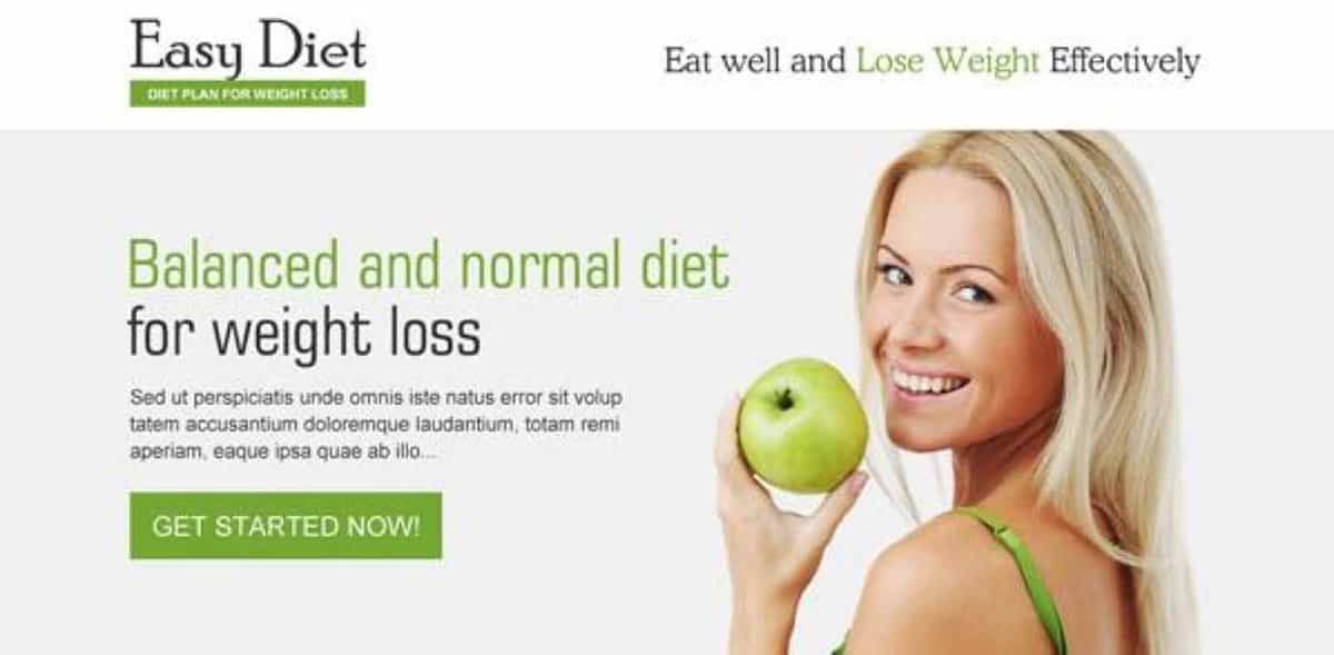
Use high-quality, eye-catching images
One thing that can drag down the quality of a web design is the use of low quality images. More than 50% of the people visiting a webpage linger on if the images are of high quality and around 20% would prefer to do business with a website which has an image on its landing page. Don’t use bland images. Use images which are lively and that make your page more effective. Using brand image or a corporate kind of image can turn away the visitors. People like brands which they can connect to, so choose images which can connect to your target audience.
-
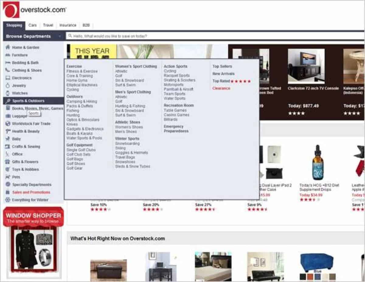
Don’t forget Hick’s Law
According to Hick’s law, with every additional choice given to the visitor the time to take decision is prolonged as well.
The basic principle for web design for boosting conversion is to keep it simple. The more complicated the design, more confused users will be. It is also important NOT to give visitors too many choices. Yes, you have read it correctly. With too many choices to make, users can turn off from the page without making any decision. Keeping it simple, give them choice between two options. This will make decision making easier for them. When there are multiple choices, give your visitor options to filter through them to achieve what they want.
Following is an example of web page which gives users too many choices thus resulting in delays for conversion:
Do you know about any other web design principle that can help in increasing the conversion rate of a website? Let us know in your comments below.