Feedback of Wimbledon.com after the site hits the net
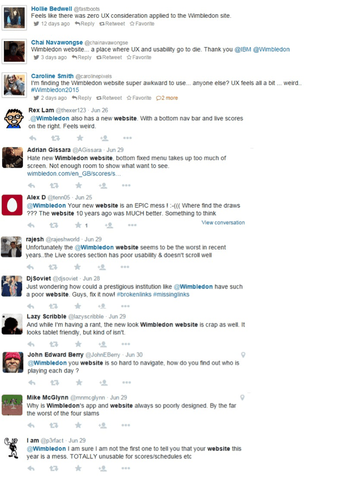
With device browser activity increasing, there is also an increased demand from consumers to expect websites to provide information at the ready without usability issues. After monitoring Twitter recently however, there have been a number of tennis fans airing their voice on user experience (UX) issues arising in the wake of the refreshed Wimbledon.com in the space of less than a week. IBM have created websites previous websites for Wimbledon, however this year is already seeing a lot more negative feedback on the new website than seen in previous years.
Advantages vs faults
It is great news that Wimbledon and IBM have worked together to create a mobile app and a website which now renders more effectively on tablet and mobile devices. There have also been a handful of compliments on the more modern ‘design’ of the site, and also a few funnies in-between wondering why Wimbledon chose .com over .net!
There are however early indications which showcase that there are clear frustrations with the desktop site (in particular) being a challenge for usability, especially in relation to the navigation.
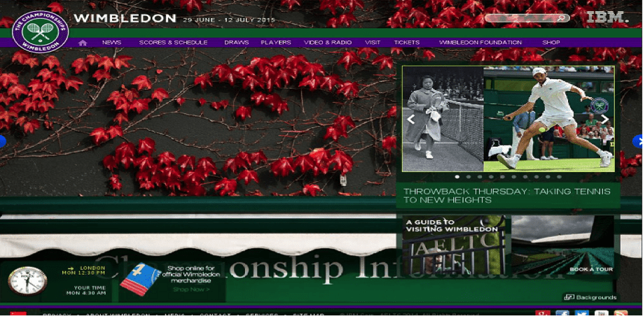
May 2015 – previous site. Navigation along the top
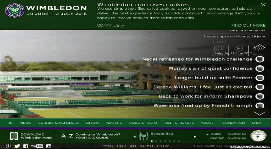
June 2015 – new site. Navigation along the bottom
The digital team at Wimbledon have expressed a wish for the site to be different. Quote – “we’ve used a long application along the bottom of the homepage. Although this goes against what websites would traditionally use, we wanted to create a focused featured content area with everything in one place, in a ‘less is more’ approach, making it simple so people know where to go.”
We can take this as a clear indication that Wimbledon have been brave in taking a slightly different approach to traditional web design for this year’s championships. But have user experience considerations been overlooked if looking back at the negative noise being made on Twitter?
Time for our UX designers to cast their hawk eye
Our UX design team at Decibel Digital have shared their views on the pitfalls on site usability. Here are a few points from our team:
- There’s a search bar beside the IBM logo at the top, but no indication that it is one (guessed it was one but had to test it out to make sure). The previous version of the Wimbledon site showed a magnifying glass to help users
- Weather is displayed at the top, but the clock is displayed at the bottom. It would feel more natural and normal if those two were grouped together
- People tend to read from left to right, up to down so I don’t get why they would push everything towards the farthest corner from top-left? We have heard that Wimbledon wished to adopt a different approach, however this may be going too much against the grain
- Homepage imagery doesn’t appear to be live 2015 championship imagery, which would be more exciting and effective. The images currently seem to be more abstract
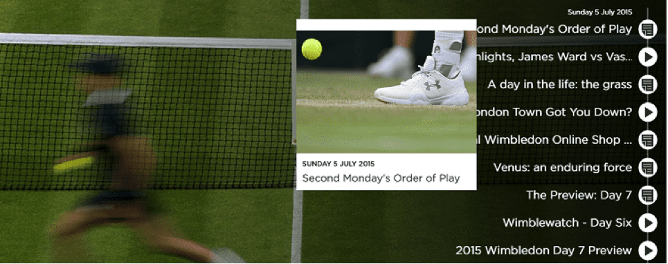
- The pop out images on the homepage are fiddly, lack of proper rollover and they much of the other text (see below)
- A key call to action ‘order of play’ not visible on the homepage. Instead this is shown under ‘scores and schedules’ in the navigation, then ‘order of play’
- Lack of filters on one of the most important pages ‘order of play’. Cannot filter quickly by court or player. Instead, the page scroll is incredibly long
- On secondary pages, the close proximity of the two footers results in the cursor showing the bottom navigation rollover (B) on top of the top navigation (A), thus covering the top navigation showing ‘order of play’. Steady cursor movement required
A)
B)
- The ‘IBM Slamtracker’ pop out window is a little frustrating
Summary to date
In all fairness, the website is relatively new and the tournament is currently in the second week, so there needs to be ample enough time allowed to garner all feedback from tennis fans. Although it is difficult at this stage to draw any UX conclusions on the website, red flags have already appeared; hence our initial thoughts.
On a positive note, the tournament will attract millions of visits from across the world, providing a huge pot of data to analyse a multitude of user journeys across all device types.
If further negativity around the usability of the website continues to be aired across channels such as Twitter during the tournament and beyond, it may be time for Wimbledon to review their website UX. These usability issues may become more apparent through further analysis after the tournament, providing the appropriate tools are in place to support a holistic analysis of these user journeys.


