
Animation can be a powerful design element that boosts UX of websites and apps and results in more sales, but done poorly it can be a distraction and damage conversion rates. How can animation and UX work best together?
Animation can give life to the static images you use on your website and can help to convey your message or tell a story effectively and engagingly. However, using animation goes much deeper than just being eye-catching.
Keeping your user engaged on your site is your mission and when used right, animation can help you to achieve that. But you need to put plenty of thought into how you place and use your animations.
While adding animation can add a bit of flair to your visual design it would be a mistake just to add animations for their novelty value. Just placing animations randomly as an afterthought for the sake of it can lead them to be used for the wrong purposes and can end up confusing your users rather than enriching their user experience.
Keep it simple
When kept simple and functional, animation can be used positively to:
- Reduce cognitive load
- Prevent screen change blindness
- Create better recall in spatial relationships
Your animations must serve a purpose so it is important not to over-embellish them or put too much focus and attention onto them that could be distracting to your users. For example, if you wanted to add a functional arrow animation to show where a user should click next or where an object will go once a button is clicked, it will help to keep the arrow animation simple.
Carefully evaluate every animation you want to add to your design. Define their use and purpose for being there. Is it a gratuitous animation? Is it really needed? How much time should you dedicate to creating it? There is little point in spending a lot of your precious time on an animation if it is something that the user will quickly be bored of.
Reflect your brand with your animations
You may have spent weeks honing your design down to the tiniest pixel so you will want to make sure that every element of your design ties in together, including your animations to ensure you get the most emotive brand response.
While it may be very tempting to let your creativity run wild with your animations and let’s face it, the possibilities can be endless here, but there is little point creating animations that bounce around the screen like a happy kangaroo if you are designing a site for an undertaker or a team of divorce solicitors.
You can add some personality to your animations, but consider the tone you want to convey before you go ahead. If the tone of your animations doesn’t reflect the message of the site, then your users are going to feel confused and uncomfortable, or even startled by their experience. This could drive your users away and make them lose trust in your brand.
Animations shouldn’t be distracting
There is a great difference between creating engaging animations and ones that are distracting. Remember that your animations need to serve a purpose to convey a message or to give instructions, but they should never be the star of the show.
If you overwork your animations and allow them to take centre-stage, you are not delivering an overall user experience, but rather making your users watch a show. Remember that you only have a few short seconds of user attention so you want to use your animations to keep them on message.
By making your animations too entertaining, you could distract the user from doing what they are there for and also make them forget where they are supposed to go next.
Keep your animations unobtrusive to help enhance your UX. They need to be subtle and brief.
Learn how to optimise your website UX with these video and animation techniques.
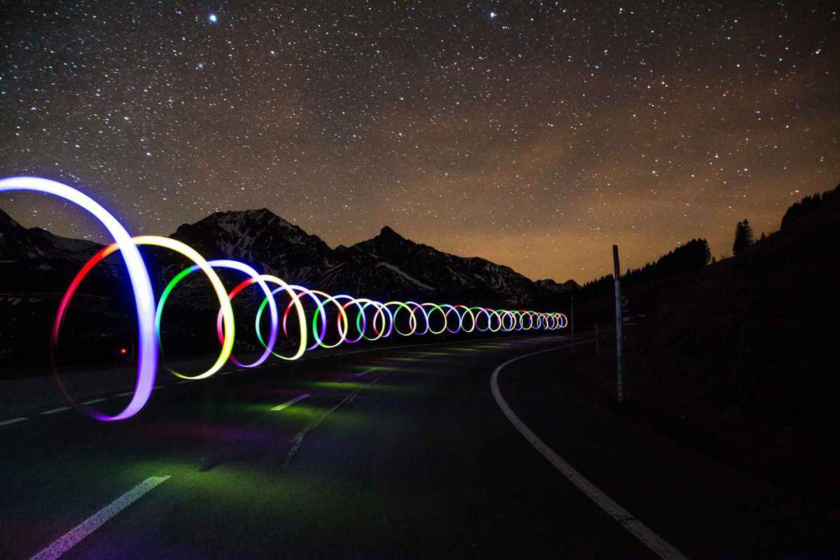
Using motion and animation
Motion and animation can be engaging and communicative when used appropriately with subtlety and restraint. Motion is most useful for subtle feedback when users complete micro-interactions. They can be used effectively as visual hints for first-time users who may need a bit of help or guidance to understand how to use the interface, especially if the user is unfamiliar with gesture-driven responses used within an app.
Motion animations are eye-catching because our peripheral vision is responsible for detecting motion. As early hunter-gatherers, humans used their peripheral vision to discern danger and threats so we could quickly defend ourselves.
We still retain this primal ability so our vision can be easily distracted by motion, whether it is meaningful or not. That is why motion animation works so well to attract users attention and deliver a message. You just need to make sure the message you want to convey with your animation is relevant to your brand and the user experience.
Duration and speed of your animations
The overall duration of your animation should be slow enough to allow users to absorb the message you want to make, but quick enough not to bore the user and cause them to wait too long.
According to research, the optimal speed for interface animation is between 200 and 500 ms. Anything shorter than 100 ms is too instantaneous for the brain to be recognised, but animations longer than 1 second would cause the user to become bored.
When it comes to smartphones, Material Design Guidelines suggest running animations with a duration of between 200–300 ms. For tablets, this should be around 400–450 ms. The reason why you need a 30% increase in duration for a tablet is that the larger screen size has a longer path when animations change position.
The same goes the other way, so for a wearable smartwatch with a small screen the animation should be 30% shorter in duration as the distance to travel is shorter.
Animation easing
Easing your animations can help to make them look more natural and easy on the eye. This means to make them accelerate or decelerate just like objects do in real life. Easing is a basic principle of all successful animation and the topic is well covered by two key Disney animators, Ollie Johnston and Frank Thomas, in the book The Illusion of Life: Disney Animation.
Good animation design and integration can only help to boost UX when used at the right time and in the right place. It is an element of your design that should be discussed and planned with your design team as an essential element to your design and not as an afterthought once your project has been completed. Your animations should be a natural part of your design process.
If you would like some help and advice about using animation in your design project to improve your UX, then do not hesitate to contact us at Creative.onl.